B2C
Mobile UX/UI
Education

ROLE
Product Designer
TIMELINE
2025
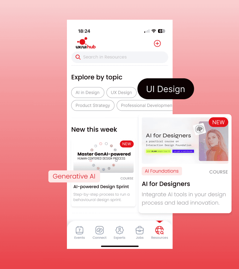
UX/UI Hub helps designers grow through a growing library of 400+ resources. With 20K+ clicks per month, the platform was working, but valuable content was getting buried, and engagement dropped off the further you scrolled.
I restructured the discovery experience around three user mental models, creating clear entry points that reduced scrolling and deepened engagement across content types.


PROBLEM
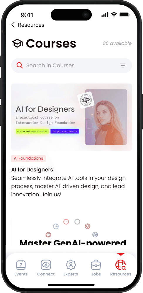
As the library grew, finding the right content became more difficult
The library had no filters or smart entry points. Finding relevant content depended entirely on scrolling – a high-effort experience that doesn’t reflect how people actually want to browse.

SOLUTION
Reshaping discovery to match how people actually search for content
Fewer choices upfront leads to faster decisions. I introduced easy entry points that instantly filter for relevant results, so you're not stuck scrolling through hundreds of resources.
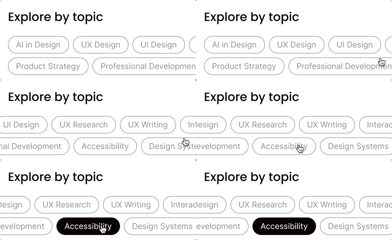
Segmenting the experience by topic area
400+ resources tagged and grouped into ten high-level topic areas, so designers looking to learn something specific can narrow down instantly rather than scrolling through everything.

Selecting the mode to match your current needs
For more casual browsers, a dedicated entry point to filter by content type. Quick, lightweight engagement is useful when you only have a few minutes to spare.

CONTEXT
A growing library with a discovery problem
UX/UI Hub's growth strategy depended on diversifying its content. But as the library expanded, resources got buried in long carousels. Every extra scroll increased the risk of users abandoning the platform.
KEY INSIGHTS
There was no way to navigate content meaningfully
Weak visual hierarchy and a lack of metadata made it hard to judge whether a resource was worth tapping into.

Newly added sections are largely undiscovered
Only the top carousels got traffic. Newer sections were buried below the fold, and users dropped off before discovering them.

MISSION
Help designers easily find relevant resources and stay engaged as the library continues to scale
I mapped the business objectives to a north star metric to make sure every design decision was grounded in measurable outcomes rather than assumptions.

RESEARCH
Understanding how designers actually browse for content
Rather than jumping straight to a simple sort and filter solution, I wanted to understand the mental models at play. How do designers typically browse for resources? Do browsing patterns differ by experience level?
Behavioural data and feedback from real designers pointed to three distinct browsing modes.
IDEATION
Breaking down the content hierarchy of other UX/UI resource hubs
There are various platforms where designers go to learn. Competing platforms simplify discovery through personalisation or social proof to reduce the effort needed to decide what to engage with.

But these platforms hosted a single content type: Medium has articles, Maven has courses. UX/UI Hub's challenge was that it needed to help users navigate across both topic and format within the same library.
CONSTRAINTS
Structure had to do the work that infrastructure usually does
This was a no-code product with no backend database. Without saved preferences, the solution had to work for everyone: first-time visitors, casual browsers, and returning users alike.
No personalisation
Without stored preferences, the app couldn't surface recommended content or remember what users had already seen.
No dynamic filtering
Rebuilding core filtering functionality required complex engineering that wasn't accessible within no-code constraints.
DESIGN DECISION
Making relevance visible before the tap
Without personalisation, the cards themselves had to do the work. I carefully considered which metadata to surface so users could make a quick relevance judgment before tapping. When scanning 20+ cards, small friction on every tap adds up fast.

DESIGN DECISION
Hiding sub-topic filters in a bottom sheet
Users can filter by sub-topic within each topic page. My initial concept showed all sub-topic chips upfront, dynamically filtering the page as users selected them. But this wasn't technically feasible within no-code.
Plus, showing all chips upfront cluttered the interface, particularly for casual browsers.

A bottom sheet kept things clean. Users who need granular filtering can find it, and everyone else wasn't distracted by it.

SOLUTION
Reshaping the discovery experience to match how people actually search for resources
The old single-feed design forced everyone through the same path, regardless of their intent. I restructured the discovery experience to match the mental models of the three types of users.

Highlight "New this week"
Surface the three newest resources with clear meta-data to quickly understand its relevance.
OKR: +20% engagement with new resources
Move up Articles section
A low commitment entry point placed higher in the feed to encourage quick exploration.
OKR: 2x engagement for Articles & Challenges
This three-part structure gives users choice without overwhelming them. Instead of scrolling endlessly, they could self-select into the browsing mode that match their current needs.

Sort & filter options
Sub-filtering and sort by date, read time, and level to further narrow down a long list of resources.
OKR: Reduce friction in discovering content
Clear indicators
Show total count of filtered results to set expectations and communicate depth of content.
OKR: Reduce scroll depth to first interaction
VALIDATION PLAN
The bigger win is learning what works
This redesign creates a real opportunity to learn how designers actually prefer to discover content. By tracking which path users start with, we can make informed decisions on where to invest next.
Rather than guessing what to build, we create a data foundation that reduces the risk of building the wrong thing next. The platform can now scale without overwhelming users, and the business has a foundation for making smarter product decisions in the future.
REFLECTION
Honest takeaways from this project
Constraints help sharpen thinking
The obvious solutions aren't always feasible. Constraints pushed me to think differently and find clarity through structure instead.
Understanding mental models first
Taking a step back to understand how people actually browse reframed the problem and led to a solution built around real behaviour.